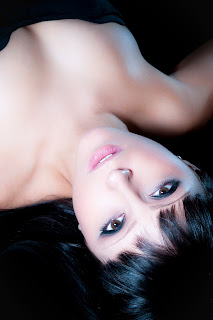
From the recent "F you" photoshoot with Pamela Beck I have worked on the bed image of her yet I can't decide which colour of image I like more.
Here are the 3 images with my thoughts, Please let me know yours.
Here are the 3 images with my thoughts, Please let me know yours.
This first edit is after all the skin softening has been added the white balance was at 5500k with no change in tint. The image looks ok to me but it doesn't convey the atmosphere… but my question what is the atmosphere I am wanting to convey?
My first edit was to deffo give it a warm tone. I moved the white balance up to 7000k (when shooting with Nikon sb 900 speedlight which puts out at 5500k, changing in camera or post edit white balance to a higher temp makes the image more orange in colour)
Now to me this is much more of a Hollywood style look, its warm and inviting, it has golden skin tones.
Then my second White balance edit was to bring it lower than correct, here it is down to 4000k.
To me this image has a total different look, it has gone from warm and inviting to cool and seductive. It reminds me more of a perfume advert or a fashion shot rather than a portfolio image.
This image is more Vodka while the shot above is more Rum and Coke, and the first image is Gin.
What do you think and what do you prefer?
Fyi
Shot taken with the Nikon D300, Tamron 28-75mm f2.8 @ f/8 and the Nikon SB-900
Here is how I edited the images
Facebook
flickr account
Twitter
Website
wedding website
Photobox gallery page
Sport in waves
Browse other personalized gifts from Zazzle.
Do not look at the site or tshirts if you are under 18 years old
you have been warned
The link for UK photographers check out
http://www.zazzle.co.uk/sportinwaves
For the US buyers click below


The third is the only one with any 'atmosphere' but they're all a bit too soft methinks...
ReplyDeleteThe third one. After all I'm a Fashion Photography student.
ReplyDeleteAll are great the but you nailed it with the third one. The cool tones make her much more mysterious and sexy.
ReplyDeleteThe cool tones. Super sexy and more in line with your style. IMHO.
ReplyDeletemost of the people would prob go for the third one, as it it what we see on adverts and billboards every day. Nothing wrong in that, its just what the brain is used to seeing. From the other hand it would be up to what kind of mood you want it to be in? But personally, i would go for the second one, maybe with some wee tweaks (some sculpturing on the skin as you lit it nicely and it would be a shame to let shadows blend with highlights, and some extra depth to eyes:) Good work and loving the earrings!
ReplyDeleteI like her face warmed up in the 2nd one, but find the "neck down" in that shot a bit too warm/orange for my taste.
ReplyDeleteI dig the 3rd one too.
Did I miss where you said what it was for?
it wasnt for anythiiing. its just a friend from work who I asked if she wanted to do a fun wee shoot this saturday.
ReplyDeleteVodka all the way :)
ReplyDeleteI like the first and the third. Maybe the third is a tiny touch to cold, but overall I'd choose the third one.
ReplyDeleteThe third one gets my vote as well :) The first one is good as well, but the almost fake tan like tint of her skin on the second one doesn't do it for me at least...
ReplyDeleteIt's a toss up between the first and third one for me. I think the third one is more natural looking and the first one is a good ballance between all three images but the second one is too warm for my liking. If I had to go for one over the others I think I would pick the third one Dom.
ReplyDeleteEither way a lovely shot of a lovely model.
It is a very close call but I prefer the third one. Also, to me, its a bit soft around the chest area.
ReplyDeleteGreat Job once again Mr. Dom, thank you! Keep 'em coming..
The first two remind me of badly lit(and make-up) cheesy glamour shot gigs....the third cooler image has a certain sophistication about it.
ReplyDelete(I think because the cooler one is somehow reminiscent of black and white work)
But.....in the end, its your call.
(But the third one IS best!)
:)
I personally like the second one best; its the most warm and seductive in my opinionn. However, keeping in mind the theme of the shoot I'd go with the third one. Why? The second one says, "F me" but the third one says, "F you!"
ReplyDeleteI like the cold white balance! Great shot btw, Dom.
ReplyDeleteDef the cold one!
ReplyDeletethe cold one definitely i'm sorry i cant tell you why its just the feeling
ReplyDeleteThe cold defo!
ReplyDeleteI would do the cold one but make the lips more red so she is not so dead looking.
ReplyDelete3rd one... Vodka for sure!
ReplyDeleteI like the third one, but I prefer the contrast of the second one! Great job on the editing video... Can you make a vid on landscape editing?
ReplyDeleteI like the second one!
ReplyDelete